- i only speak liquid
- Posts
- "i only speak liquid" #77: Theme Block Nesting Architecture
"i only speak liquid" #77: Theme Block Nesting Architecture
Written by Elisa (a Storetasker Expert)
Elisa Ellis
June 11, 2025
Hey everyone,
So so excited to announce our new writer: Elisa Ellis!
Elisa is a 14-year e-commerce vet who’s worked with a bunch of DTC brands as a freelancer, full-time employee, and agency dev.
She’s passionate about taking old things and making them better, so she loves working with brands with chaotic old codebases to build new features and improve site speed.
Ofc: She’s an expert on Storetasker 😉 apply here.
Let’s dive in 🤿
What I’ve been thinking about:
Theme Block Nesting Architecture or — just because you can, doesn’t mean you should
Several years ago, I moved all of the data for a client’s Shopify store into Contentful. It was my first time being able to structure content however I wanted - so I organized it like a developer. Pages contained sections contained components contained components contained components contained…
You get the idea.
It wasn’t until merchandising got in there that I learned I’d created a monster.
I recently built a new theme for one of my clients using theme blocks and got to work on . They’re powerful and useful and subject to the same pitfalls, so I’ve been stewing on how things can get out of hand - and how to avoid it.
Say you’re breaking this slider section design into blocks. How would you do it?
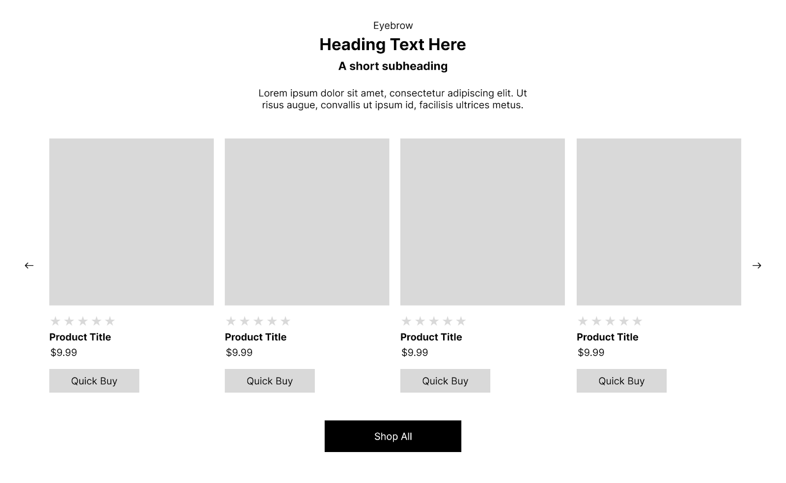
At the top level, it’s obvious - you’ve got a section with a title lockup header, a footer with a CTA, and a slider in the middle:
The title lockup has a bunch of heading styles; let’s break each line into a block, Dawn-style. Plus that button in the footer should definitely have its own block. And those product cards in the slider? Blocks.
Since there are a few different ways the product cards can look and you want to give your client maximum control, you make each line a theme block. Now your product tiles have theme blocks for a star rating, heading, subheading, short description, price, quick buy - and what if they wanna put the image on the bottom? Better make it a block too.
Now your client can move these around in whatever order they want, add them as needed, remove them, double up, etc. It’s powerful, and it gives them a ton of control. Amazing. Right…?
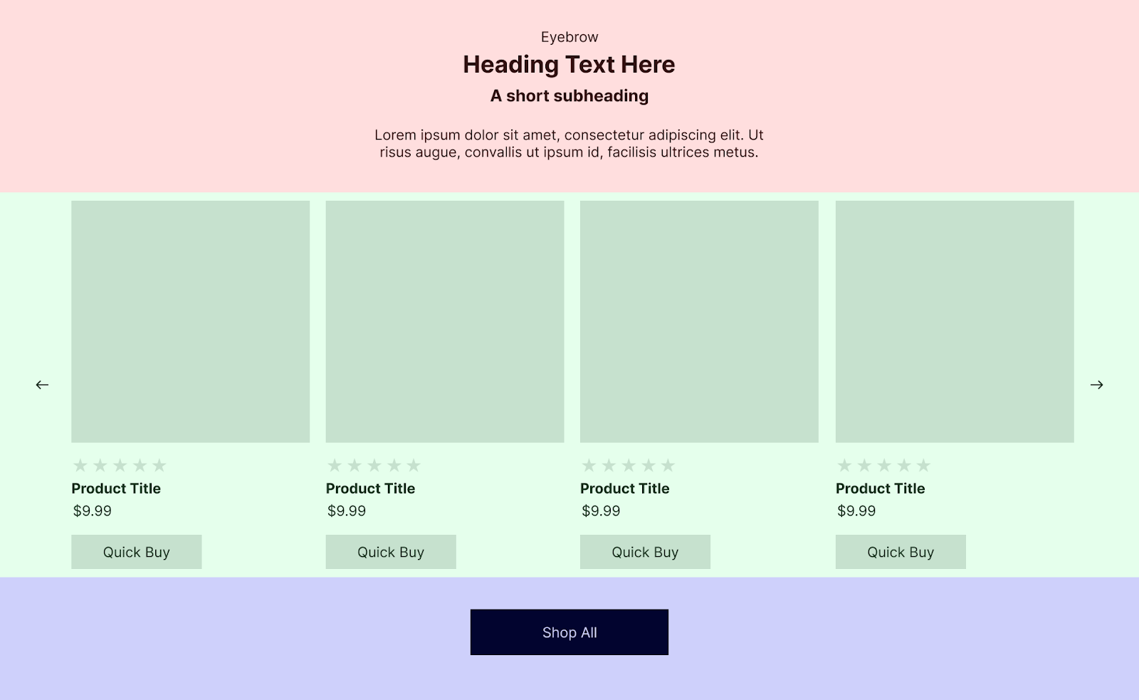
Let’s take that control even further and get really granular.
We need to set a max width on the section in a sane way - make it a block.
We need complete background color control - make it a block.
It can get crazy fast.
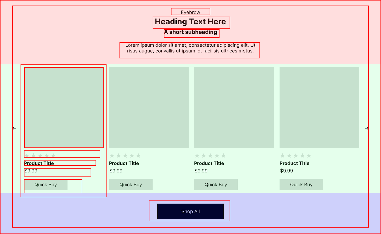
Before you know it, you’ve architected a theme that forces your client to click through 5 levels of blocks so they can change a heading - and some of these theme blocks are so granular you’re not even going to be able to reuse them. Updating settings takes a lot of extra time and - even with presets - effort. Down this road lies madness.
If we put ourselves in the shoes of the merchandiser who got the Big Holiday Sale assets late who now needs to put them in a theme that’s going live in an hour to promote said Big Holiday Sale - what do we actually need to control?
The text on top, what collection the products are coming from, where the Shop All button goes and what it says - so let’s streamline:
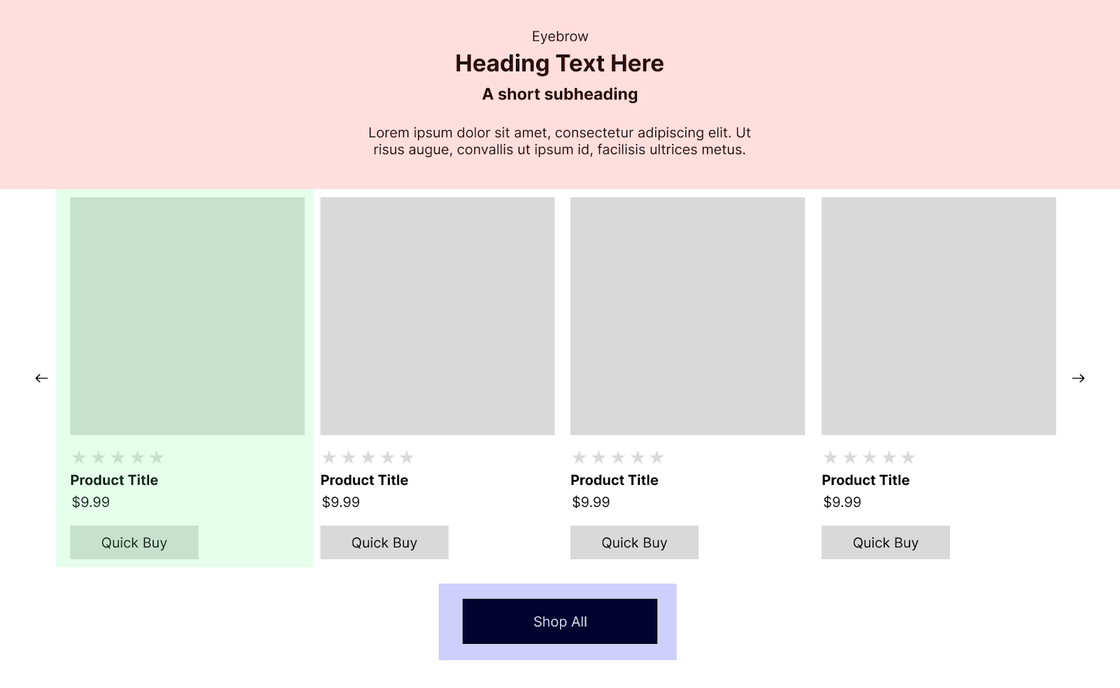
This breaks the section down into relatively complex theme blocks we’ll definitely reuse. Most sections will probably have the heading lockup, buttons are everywhere, and product cards will at the very least exist in grid form on your collection pages.
These theme blocks are also complex enough that it makes sense to put them in their own buckets instead of copy-pasting the same set of settings across a bunch of different sections.
The client has less control, but they’re not dealing with buckets of buckets of buckets of blocks every time they need to make a change - and by focusing on the controls that really matter, we’re letting the client spend their time setting up promos.
For the pieces that are repeatable - a slider, a max width, a background color, a heading - we can use snippets to keep things consistent on our end without surfacing nuts and bolts that the client doesn’t need to wade through every time they go to make a change.
Obviously, this isn’t a one-size-fits-all approach. I recently got to work on a project where the client wanted all the control (and had the resources to take full advantage of it). I’m proposing a default starting point. Theme blocks are an awesome step forward for Liquid theme development; let’s keep things sane.
3 links you can’t miss:
Since we’ve been looking at a carousel, here are two I’ve been using recently that I like:
📌 SwiperJS
📌 Embla

1 app I like:
Rapid Reviews: I was really impressed with this little app. It took five minutes to set up and even lets customers write reviews using AI to make it as easy on them as possible.
One learning as a freelancer:
I got into this a little in the article, but I believe it’s so important to think about the way your clients will be using the thing you’re building.
I once inherited a bundling feature that required every single combination of items to be added as a separate variant. The variant titles tied everything together, so they had to be exact. Adding a new bundle took days.
As freelancers, we are uniquely positioned to know how our clients work - do they have a team? Are they overwhelmed and essentially solo? - and tailor our solutions to their needs.
